 |
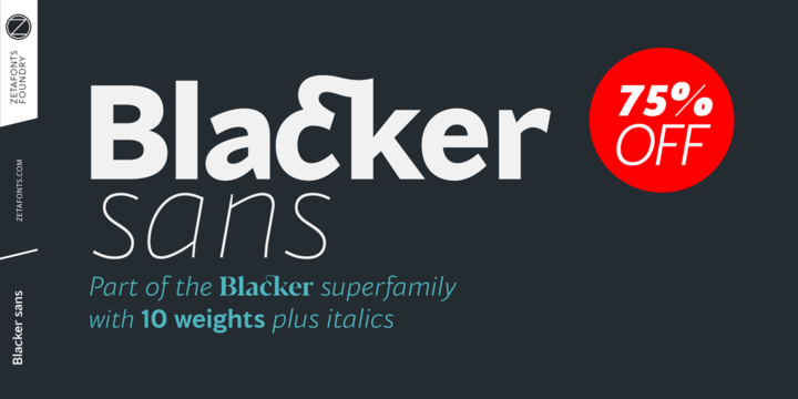
Blacker Sans is Francesco Canovaro newest addition to the Blacker typeface family created for Zetafonts by Cosimo Lorenzo Pancini and Andrea Tartarelli after the inverse contrast Blackest,. Born for flawless font pairing in complex branding and editorial projects, Blacker Sans parts with Blacker’s spiky wedge serifs without loosing its dark, elegant character while extending its weight range to include thin, extralight and heavy for maximum versatility in display use.
Contrast in the typeface is reduced to grotesque proportions, with optical corrections and fine design details to express the family identity. The result is a highly legible workhorse family that manages to keep the signature details of Blacker: the hook shape of lowercase “f” is hinted in “a”, “c” and “e”, while a nod to the original family spiky shapes appears in the ink-traps in “n”,”m”,”r”, “P” and “R”.
This combination of a robust design skeleton with fine design details makes Blacker Sans suited for body text usage but still expressive when set in large size for display or logo use.
With its wide set of OpenType features ranging from ligatures (both standard and discretionary) to stylistic alternates, small caps, positional numbers, and alternate punctuation; and its 1000+ characters offering language support for over 200 languages using Latin, Cyrillic and Greek alphabets, Blacker Sans is ready to become your next best alternative to the same old boring grotesque sans typefaces for branding, editorial or digital design.