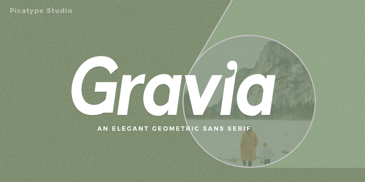
Gravia is an elegant sans-serif display font, a modern font with a touch of classy elements. Gravia is neutral, flexible, and contemporary, based on several characteristics found in humanist typography. Gravia's features - along with its design characteristics - are suitable for a variety of applications.
Perfect for branding, weddings, social media, packaging, greeting cards, clothes, mugs and more! Use previews as your inspiration. There's a lot you can do! Can't wait to see what you produce!
Gravia features:
- OpenType
- Multi-lingual support
- Uppercase and lowercase letters
- Accent characters and marks
If you have questions, let me know in the comments section or DM or send me an email at picatypestudio@gmail.com
Showing posts with label cursive font. Show all posts
Download Gravia Font Family From Picatype
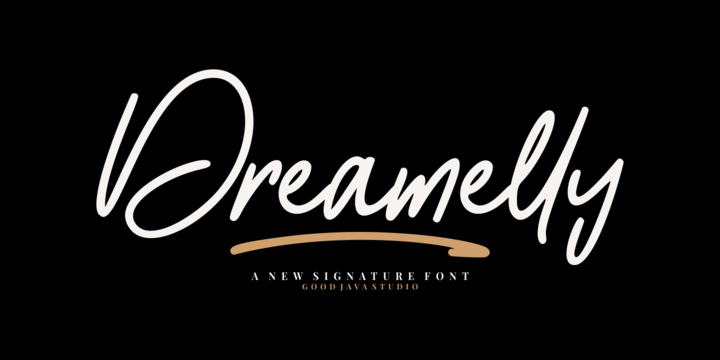
Download Dreamelly Font Family From Good Java Studio
Dreamelly was born from hand writing style fonts. It is versatile and useful for design posters, logos, branding, labels, quotes, headline profiles, banners, t-shirt design, packaging, magazines, brochures, and much more in your amazing work.
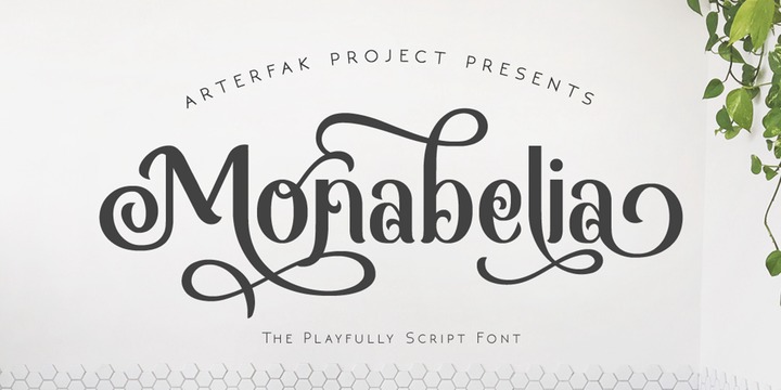
Download Monabelia Font Family From Arterfak Project
Greetings. Introducing our new font "Monabelia". The elegant playfully font which made with a combination of sans serif and brush script style. Almost all of the letters have sans serif taste at the top and script taste at the bottom of the shapes, also the tails/flourishing.
You can feel the freestyle with combine the stylistic, contextual alternate and the ligatures but still elegant with the neat layout of the shapes. There are 100+ additional glyphs in this font that you can use it for your design, especially for your headline, display (recommended), subheadline and quotes!
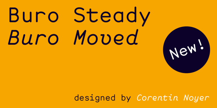
Download Buro Font Family From Corentin Noyer
Buro is a modern monospace font, both geometric and stable in it’s Steady (Regular) style, and cursive and animated in it’s Moved (Italic) style. The Buro is characterized by it’s monolinear outline (light optical corrections) and it’s rounded endings that make it softer and easy to use in reading contexts as varied as possible (book, website, mobile application, logotype, visual identity, etc.)
The simplicity of his design based on elementary geometric shapes, as well as these open counterforms (grotesk ending) and his big punctuation allows him to ensure versatility and good readability (and lisibility). These trumps for reading are supported by a glyphset for extended Latin, and some fun ligatures.
Enjoy it !
:)
Subscribe to:
Posts
(
Atom
)